
-
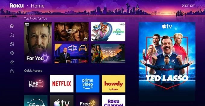
Roughly a decade ago, a tech insider dismissed Roku as a company making cheap hardware for Walmart customers in flyover states. Intended as an insult, this critique missed a crucial point: Roku's refusal to chase coolness became its greatest competitive advantage. Now, with over 100 million households using its platform, the company's latest homescreen redesign proves that simplicity wins in the streaming hardware market.
While competitors like Amazon and Google focused on flashy interfaces and premium ecosystems, Roku targeted the massive audience of non-tech-savvy users. Preston Smalley, Roku's VP of viewer product, recalls visiting homes where people taped over remote buttons to simplify them. Roku's approach: build products that work for everyone, including those who need a son to set up their apps. The result is a platform that feels familiar, predictable, and—most importantly—accessible.
Most streaming platforms have embraced content-forward interfaces that surface movies and shows directly on the homescreen. Amazon's Fire TV and Google TV lead with wall-to-wall hero art and autoplay trailers. Roku's new homescreen takes a different path: a compact, personalized top picks for you section followed by a tight grid of apps and content tiles, paired with a retractable sidebar and a prominent ad slot.
Roku's refresh looks predictable—even boring—compared to its rivals. But that's exactly the point. The interface minimizes distraction, avoids overwhelming users with autoplay video, and keeps the app-icon layout that existing customers already love. As Smalley notes, "I don't think ours looks like those others." It stands apart by being less intrusive while still delivering personalized recommendations.
Roku understood early that cord-cutting was primarily about saving money. The company priced hardware aggressively, partnered with budget TV makers like TCL, and invested heavily in free, ad-supported television. But the deeper insight was demographic: as all TV moves to streaming, tens of millions of non-tech-savvy users need a simple on-ramp.
Roku's user research revealed that many people use only a handful of apps. Some rely on family members to configure their devices. The new homescreen's auto-updating quick access section addresses this directly—no configuration required. Smalley emphasizes: "You want to have one experience that works for everyone."
A surprising cult hit during the pandemic, Roku City—the company's screensaver—now has its own app icon. Users no longer need to wait for it to appear. Roku has expanded the feature with ad campaigns, minigames, and even a live concert. Next up: bringing Roku City to mobile, leveraging its 34 million monthly mobile app users.
The new Your Daily Scoop section serves zeitgeist-driven recommendations for holidays, awards, and pop culture moments—but not hard news like war. Roku lacks the first-party data of Google (search trends) or Amazon (Alexa usage), so it compensates with third-party data and large language models. This curated approach may have slip-ups, but it highlights Roku's commitment to safe, accessible discovery.
If Roku City comes to mobile, expect it to be deceptively simple—and incredibly successful. That's the Roku way: build for the masses, ignore the cool factor, and let the numbers speak for themselves.

2.5K articles

1.4K articles

34 articles

28 articles










Comment