After more than a decade, Google’s gradient ‘G’ logo is rolling out everywhere, refreshing the company’s look across its apps and services. The redesign started showing up earlier this year, but now Google is making it official as the new brand identity across its ecosystem.
A Fresh Look After 10 Years
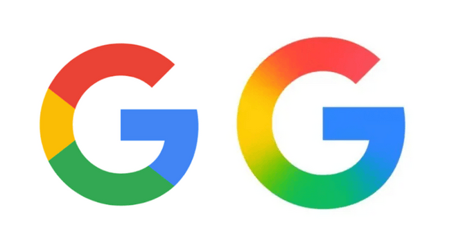
Google hasn’t changed its core logo in a decade, but this shift introduces a more modern, gradient-filled design. The new “G” blends red, blue, yellow, and green into a vibrant gradient, moving away from the segmented colors of the 2015 version.
According to Google, this update reflects the company’s ongoing transformation in the AI era, tying the new logo closer to its Gemini branding.
Where You’ll See The New Logo
The rollout began in May with updates to the Google app on Android and iOS. Now, the gradient logo will expand across Gmail, Drive, Meet, Calendar, and other core apps.
Google has also updated the Google Home logo to match the new design, signaling a broader push for visual consistency. Over the next few months, users will notice the refreshed gradient look across all major Google services.
Why The Change Matters
Google’s logo updates are rare, which makes this shift significant. By adopting a unified gradient design, Google is not just refreshing its identity but also aligning its visuals with its AI-powered products. The change is both symbolic and practical—bringing familiarity while signaling innovation.
Google’s gradient “G” logo is more than a cosmetic tweak—it’s a sign of the company’s direction in the AI era. Whether you’re checking Gmail, setting a reminder in Calendar, or browsing with Google Search, the redesigned logo is rolling out everywhere to create a consistent and modern experience.


Comment