
Google Workspace Icons Get a Fresh Redesign: What You Need to Know
-
2 minutes, 1 second
Google is rolling out its redesigned Workspace app icons, giving Gmail, Calendar, Drive, and other tools a modern, unified look. This update makes it easier to identify and use your favorite apps across devices.
What’s Changing with the New Google Workspace Icons?
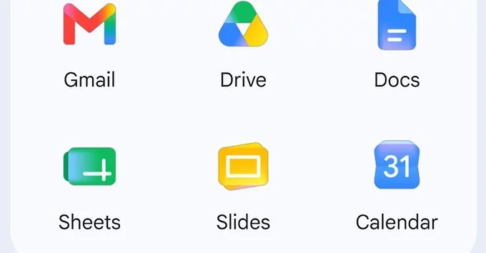
The new icons feature brighter colors, simpler shapes, and a consistent design language. For example, the Gmail icon now uses a more vibrant red envelope, while Google Calendar sports a cleaner blue date tile. These changes aim to improve visual clarity and brand consistency.
Key Updates at a Glance
- Gmail: Brighter red envelope with a white “M” for faster recognition.
- Google Calendar: Simplified blue square with a white date number.
- Google Drive: Triangle shape gets a bolder blue and yellow contrast.
- Google Meet: Camera icon updated with sharper lines and a green accent.
Why Did Google Redesign the Icons?
Google wanted to create a more cohesive experience across Workspace apps. The old icons looked different from each other, which could confuse users. The new design aligns with Google’s Material Design 3 guidelines, making apps feel modern and accessible.
Benefits for Users
- Easier navigation: Icons are now more distinct and color-coded.
- Consistent look: All apps share a similar style, reducing visual clutter.
- Better accessibility: Higher contrast and simpler shapes help users with visual impairments.
When Will You See the New Icons?
The rollout started in late 2024 and will continue through early 2025. Most users will see the update automatically in their web browsers and mobile apps. If you haven’t received it yet, check for app updates in your device’s store.
How to Get the Update Faster
- Update your apps manually via Google Play (Android) or App Store (iOS).
- Clear your browser cache if using Gmail or Calendar on the web.
- Restart your device to trigger the refresh.
What About Third-Party Integrations?
Workspace icons in linked tools like Slack or Trello may also update automatically. However, some third-party apps might take longer to adopt the new icons. If you notice outdated icons, notify the app developer.
Final Thoughts on the Google Workspace Icon Redesign
Google’s redesigned Workspace app icons are a small but meaningful upgrade. They make your daily tools easier to spot and use, especially if you work with multiple apps. Whether you’re a freelancer or part of a team, this update improves your workflow without changing how the apps work.


Contact Information


Suggested Writers
-

2.5K articles
-

1.3K articles
-

34 articles
-

28 articles

Comment