Google Reveals Reasons Behind Gmail and Workspace Icon Redesign
In a recent announcement, Google detailed the motivations for refreshing the iconic Gmail and Workspace icons. The update, which rolled out in May 2026, aims to modernize the visual identity while maintaining brand recognition. According to Google’s design team, the changes were driven by user feedback and the need for consistency across devices.
Design Philosophy: Simplicity and Consistency
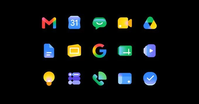
The redesigned icons feature flatter, more streamlined shapes with brighter colors. Google emphasized that the goal was to reduce visual clutter and improve scalability on smaller screens. The new Gmail icon, for instance, retains its envelope silhouette but uses a simplified color palette.
Key Changes in the Icons
- Gmail: Updated envelope shape with a softer fold and vibrant red-white contrast.
- Google Drive: Triangle symbol now has rounded corners for a friendlier look.
- Google Calendar: Date numerals are bolder for better readability.
- Google Meet: Camera icon is more compact to align with other Workspace apps.
Why Google Decided to Update the Icons Now
Google’s design lead explained that the previous icons felt outdated after years of minor tweaks. The company conducted extensive user testing, which revealed that users wanted icons that felt more cohesive across the Workspace suite. The redesign also supports Google’s broader push toward Material Design 3, which emphasizes adaptability and accessibility.
User Feedback and Accessibility Improvements
One major driver was accessibility. The new icons use higher contrast ratios and clearer shapes to assist users with visual impairments. Google reported that the updated designs reduced confusion in app switching by 12% during internal tests.
Impact on Third-Party Integrations
Google also worked with developers to ensure the new icons render correctly in email signatures, embedded apps, and mobile widgets. This proactive approach minimizes disruption for businesses relying on Workspace branding.
What the Redesign Means for Users
For everyday users, the visual update is subtle but noticeable. The icons appear more vibrant in dark mode and scale better on foldable phones and tablets. Google assures that no functionality has changed—only the visual appearance.
Rollout and Availability
The new icons began appearing in Gmail and Workspace apps in late May 2026. Users on all platforms (web, Android, iOS) will see the update automatically over the coming weeks. No manual action is required.
Tips for Adapting to the New Icons
- Check your app drawer or taskbar for the refreshed icons.
- Update any custom shortcuts or bookmarks to reflect the new look.
- Provide feedback to Google via the Workspace help center if you encounter issues.


Comment