
Alerts
-
3 minutes, 8 seconds
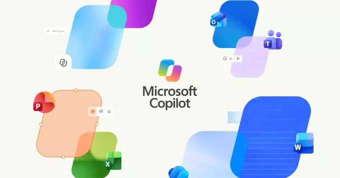
If you’ve used Windows recently, you’ve likely noticed a persistent annoyance: two distinct Copilot icons vying for your attention. One sits permanently in the taskbar, while the other appears as a standalone app icon in your Start menu or on your desktop. This duplication isn’t just a minor visual clutter—it creates genuine confusion about which entry point to use.
Clicking the taskbar icon opens the Copilot panel, but launching the app version may open a separate window with slightly different behavior or context. Users often find themselves wondering if they’re in the same conversation, or why one icon shows a notification badge while the other doesn’t. The redundancy also wastes taskbar space and forces you to mentally track which icon does what. For a feature Microsoft clearly wants to be central to the Windows experience, having two competing launch points undermines clarity and adds unnecessary friction to a supposedly streamlined AI assistant.
Microsoft has officially confirmed it is merging Copilot into a single, unified app, directly addressing the duplicate icon issue that has confused users. This decision, first spotted in a recent Windows Insider build, consolidates the separate web-based and system-integrated versions of the assistant into one streamlined experience. The company aims to eliminate the clutter on the taskbar and in the Start menu, where two distinct Copilot icons previously appeared.
By collapsing these into one app, Microsoft simplifies access while retaining the same core AI features. The merged app will serve as the single entry point for all Copilot interactions, whether you are asking for help with documents, generating images, or controlling system settings. This move also reduces confusion about which version to launch, ensuring that updates and new capabilities are delivered consistently across the board. For users, the change means fewer visual distractions and a more intuitive way to reach the assistant, as confirmed by the build’s release notes.
With this update, the taskbar icon for Copilot will no longer launch a separate, standalone experience. Instead, clicking the taskbar icon will open the Copilot app directly, which is now a fully integrated web-based experience. This consolidation means the previous dedicated Copilot icon is removed from the taskbar, eliminating the visual redundancy of two separate entry points.
The goal is to streamline access by providing a single, familiar location for all Copilot interactions. Since the app itself is now the primary interface, the standalone icon is no longer necessary. This change simplifies the user experience, reducing clutter and making it clearer where to go for assistance. For users, the practical effect is that the taskbar button now serves as the direct gateway to the Copilot app, ensuring a more efficient and unified workflow without the confusion of multiple icons.
As with most Windows features, this change is not arriving all at once. Microsoft is currently testing the merged Copilot experience with Windows Insiders in the Dev and Beta Channels. This allows the company to gather feedback and refine the implementation before a broader release.
For the general public, the company has only stated that the update will roll out to all users in a future update. No specific date or version number has been provided, so users should not expect this in the immediate monthly security patches. Instead, it will likely arrive as part of a larger feature update later in the year. As is standard practice, the rollout may also be staggered to ensure stability, meaning some users might see the change days or weeks before others. Until then, the existing double-icon behavior will remain in place for those not in the Insider program.







Comment