
Alerts
-
1 minute, 42 seconds
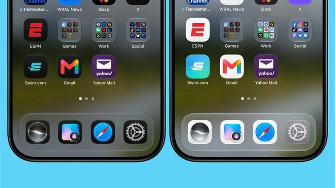
Apple's fifth beta of iOS 27 continues refining the Liquid Glass design language with a fresh set of app icon updates.
The latest tweaks bring brighter colors, more translucency, and added detail to several stock apps. Safari, Siri, Settings, the App Store, Remote, and Preview all feature new or refreshed icon designs.
The Safari icon now sports a brighter blue with more detailed compass lines and arrows. The Siri icon more closely resembles the actual Siri bubble that appears when the assistant is activated, making it feel more cohesive with the user experience.
The App Store icon has become more translucent, so you can better see each individual line forming the "A." Settings also leans into translucency for a lighter, glassier feel. Preview gets an entirely new look with a loupe over a colorful background. The Remote icon now includes more detail and switches to a gray background instead of black.
Some app icons were already updated with the initial iOS 27 beta release, including Maps, Photos, and Weather. Other apps kept their iOS 26 look—until now.
With beta 5, Apple is following through on its plan to give icons an updated layered appearance that better aligns with the Liquid Glass aesthetic. The result is a more polished, cohesive system that feels modern and refined.
It's possible Apple will update even more icons in upcoming iOS 27 betas. The company previously indicated it would be overhauling icons to better fit the new design language, and beta 5 suggests they're still actively iterating.
iOS 27 is expected to be publicly released in about a month, so these design refinements are likely part of the final polishing stages before the official launch.
This change is part of ongoing development for both iOS 27 and iPadOS 27. For more details on Siri-related changes, check out the Siri Guide.









Comment