
Alerts
-
3 minutes, 18 seconds
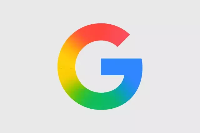
Google’s new gradient icon design is rolling out to more apps, giving them a softer, more colorful look. This update changes the way popular Google apps—like Gmail, Calendar, and Drive—appear on your devices. The new icons use smooth color blends instead of flat, solid colors, making them feel fresh and modern.
Google wants its apps to look consistent across different platforms. The new gradient design helps apps stand out while still feeling like part of the Google family. This change follows a trend toward more playful, eye-catching icons in the tech world.
Google first introduced gradient icons in apps like Google Photos and Google Maps. Now, the design is expanding to core apps such as Gmail, Google Calendar, Google Drive, and Google Docs. You may also see updates in Google Meet and Google Chat soon.
If you use multiple Google apps daily, the new icons make it easier to find what you need. The gradients add a touch of personality without being distracting. For example, Gmail’s icon now has a red-to-orange gradient, while Calendar uses a blue-to-purple blend. This helps each app feel distinct.
Google is likely to keep refining its icon style. We may see more apps adopt gradients, and even system icons (like settings or notifications) could get a similar makeover. This shift shows that Google values visual consistency and user-friendly design.
In short, Google’s new gradient icon design is a small but meaningful update. It makes apps look softer, more varied, and more modern. Keep an eye on your app updates to enjoy the fresh look.









Comment