Cloud Dancer: Pantone’s 2026 Color Sparks Big Questions
Pantone has officially announced Cloud Dancer as the Color of the Year 2026, and the choice is already raising questions many people are Googling today: What is Cloud Dancer? Why did Pantone choose a white shade? And does this color hint at a recession or cultural shift? Within minutes of the reveal, social timelines filled with reactions, from excitement over the “calming minimalism” to skepticism about its stark neutrality. Pantone describes Cloud Dancer as a “discrete white hue offering a promise of clarity,” yet its understated tone feels symbolic of a larger mood change. As brands, designers, and trend forecasters start unpacking what this new color means, Cloud Dancer arrives with both artistic optimism and economic anxiety attached.
Pantone Leans Into Minimalism With Cloud Dancer
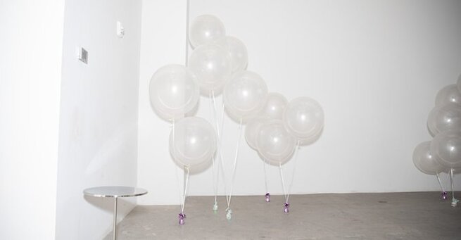
Pantone’s announcement was accompanied by imagery featuring billowy white outfits and soft cloud backdrops, reinforcing the calm, airy aesthetic of the shade. In its official statement, the company emphasized how Cloud Dancer “encourages true relaxation and focus,” framing the color as a breath of fresh air in a noisy digital world. But the choice also continues Pantone’s recent trend toward soft, muted tones—following Peach Fuzz in 2024 and Mocha Mousse in 2025. This steady slide into more neutral territory has many design observers wondering whether Pantone is tapping into a global desire for simplification or reflecting a deeper cultural fatigue.
Why Cloud Dancer Feels Like a Recession Indicator
For some cultural analysts, the color immediately reads as a subtle economic signal. Historically, during periods of financial uncertainty, design trends lean toward pared-back, muted looks—mirroring a shift toward practicality and restraint. The rise of minimalist fashion during the Great Recession, along with startups adopting stark, clean branding, still shapes visual culture today. Cloud Dancer’s almost-blank aesthetic recalls that same desire for safety and stability during unstable times. While Pantone never directly references economic cycles, its choices often reflect underlying cultural sentiment, making this year’s pick feel less like a celebration and more like a cautious whisper.
Aesthetic Trends Online Already Support the Shift
Anyone scrolling through social media in recent months might have anticipated this choice. The “clean girl” aesthetic—dominated by whites, creams, neutrals, and sleek minimalism—continues to dominate lifestyle content. Across platforms, creators are embracing stark, airy palettes that align perfectly with Cloud Dancer’s tone. This crossover between online trends and Pantone’s selection strengthens the idea that the color isn’t just a design pick but a reflection of how people present life, aspiration, and identity in 2026. It also hints that Cloud Dancer may be a commercially successful shade, especially in home décor, fashion basics, and wellness products.
Marketing Power and the Reality Behind It
Despite the symbolic readings, Pantone’s Color of the Year remains, at its core, a marketing tool. Every selection becomes a launchpad for new product lines—cookware, apparel, accessories, and branding collaborations—built around a single shade. Cloud Dancer’s neutral tone makes it particularly adaptable for wide commercial use, which may be why brands lean so heavily on these yearly announcements. But even seen through that lens, this year’s color choice feels unusually quiet. Instead of a bold statement or trend-setting hue, Cloud Dancer enters the cultural landscape like a whisper, reflecting more about the times than the trends.
Designers Split on Whether Cloud Dancer Inspires or Disappoints
As reactions pour in, designers are split. Some praise the color’s “reset button” energy, arguing that Cloud Dancer feels refreshing after years of digital overload and trend saturation. Others say the neutrality lacks ambition, calling it a sign that the industry is playing it safe. This divide reflects a broader tension in design culture—between those craving calm simplicity and those who feel the world needs bold, expressive creativity. Whether celebrated or criticized, Cloud Dancer is already succeeding at its primary job: sparking conversation.
What Cloud Dancer Means for 2026’s Creative Landscape
If historical patterns continue, Cloud Dancer could influence product lines, branding kits, UI design, and even architectural palettes in the year ahead. Its simplicity makes it well suited for tech companies, wellness brands, and fashion labels aiming for a clean aesthetic. But it also pushes creatives to rethink how emotion, identity, and storytelling can emerge from near-nothingness. The next year will show whether Cloud Dancer becomes a defining visual of 2026 or fades into the background—but for now, it’s setting the tone for a year where subtlety speaks louder than color.


Comment