Alerts

-
3 minutes, 13 seconds
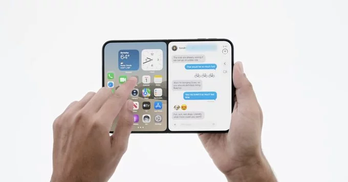
The iPhone Duo's split screen implementation has been widely praised as nailed, and it's easy to see why. Rather than forcing users through awkward gestures or hidden menus, the system delivers the multitasking experience readers came for: two apps, side by side, working exactly as expected.
What sets it apart is restraint. Apple resisted the urge to overload the feature with options, focusing instead on the essentials that make split screen genuinely useful day to day. The result feels less like a compromise and more like a natural extension of how people already use their phones.
For anyone who has waited years for proper multitasking on iPhone, this is the payoff. The iPhone Duo proves that split screen doesn't have to be complicated to be powerful — it just has to work. And according to early reactions, it does exactly that.
The iPad offers split screen and Slide Over, but the experience feels far less clean than the iPhone's. Where the iPhone's approach is straightforward, the iPad's multitasking asks users to remember gestures, drag handles, and manage floating windows that can quickly pile up. The result is a workflow that feels convoluted rather than intuitive.
This complexity stands in sharp contrast to the iPhone. On the iPhone, splitting the screen is a simple, deliberate action. On the iPad, the same goal often requires several steps, and the interface offers little guidance along the way. Users must juggle multiple apps while keeping track of which window is active and how to dismiss it.
For many, the iPad's multitasking promise of productivity ends up feeling like extra work. Instead of making tasks easier, it introduces friction that the iPhone avoids entirely. That gap leaves the iPad looking like the less polished device for getting things done.
The contrast between iPhone and iPad split screen comes down to how each feature was built and who it was built for. On iPhone, split screen arrives as a focused, deliberate addition: two apps share the display in a way that feels native to the device. On iPad, multitasking has accumulated layers over time, leaving users to navigate a system that feels less like a single design and more like several ideas stacked together.
That gap is not accidental. The iPhone version benefits from being designed fresh, without the burden of an existing multitasking framework. The iPad, by contrast, carries years of Split View, Slide Over, and Stage Manager conventions that must coexist. Each new addition risks complicating the last.
The result is a strange inversion. The device with less screen space offers the cleaner experience, while the device built for multitasking asks more of its users. Apple's challenge is not whether split screen can work, but whether it can make the iPad's version feel as intentional as the iPhone's.
If you are choosing where to do your split-screen work, the source's assessment points in one clear direction. The iPhone's Duo implementation is described as split screen done right, while iPad multitasking feels convoluted by comparison.
That distinction matters most when you actually rely on two apps side by side:
The takeaway is not that one device replaces the other. It is that the quality of the multitasking experience differs between them, and the iPhone currently holds the advantage in how straightforwardly it handles two apps at once. If split-screen efficiency is a priority in your decision, that gap is worth weighing before you commit to a device.










Comment