Android 17 Rumored to Introduce Blur-Heavy UI
Android 17 could be the most visually refined version of Google’s mobile OS yet. According to recent reports, the update will expand blur and translucency effects across system menus and controls, echoing Apple’s Liquid Glass aesthetic in iOS 26. Unlike Apple’s bold approach, Android 17 is expected to use subtler, more restrained blur effects, aiming for a clean and modern interface without compromising readability.
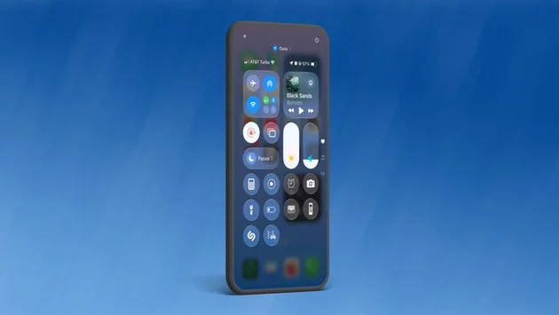
Users curious about how Android 17 will feel can expect frosted-glass overlays on volume sliders, power menus, and key system controls. Early internal images suggest semi-transparent backgrounds that adapt to your device’s color theme, creating a cohesive look throughout the interface.
Subtlety Over Flash: Android’s Approach to Blur
While Apple’s Liquid Glass sparked debate over its aggressive translucence, Android 17 appears to prioritize usability alongside visual flair. Reports indicate that Google is toning down the intensity of blur effects, ensuring that menus and notifications remain easy to read while still offering a sense of depth and sophistication.
This careful balance could make Android 17 more accessible for users who found iOS 26’s bold effects distracting or hard to read. By focusing on subtle, adaptive blurs, Google is likely targeting a wider audience who want a visually appealing system without sacrificing clarity.
Building on Android 16’s Blur Foundation
Blur effects in Android are not entirely new. Android 16 QPR1 first introduced semi-transparent elements in notifications and Quick Settings panels. Android 17 takes this concept further by extending blur and frosted-glass overlays across more areas of the interface.
The dynamic tinting of these overlays—adjusting based on the user’s color theme—adds a personalized touch to the UI. This feature could make interactions feel smoother and more cohesive, bridging the gap between functionality and aesthetic appeal.
Comparing Android 17 to Apple’s Liquid Glass
Apple’s Liquid Glass in iOS 26 represented the most significant UI overhaul since iOS 7. While visually striking, early versions struggled with contrast and performance issues. Apple later introduced adjustments in iOS 26.1, offering toggles for “Clear” and “Tinted” glass styles to improve readability.
Android 17 seems to learn from these lessons. By limiting the intensity of blur and using adaptive tints, Google may offer a similarly elegant look while maintaining performance and user-friendliness. This approach could attract users who appreciate iOS’s style but prefer Android’s flexibility.
Android 17 Rollout Timeline
Android 17 is expected to launch in mid-2026. Google’s Pixel lineup, from Pixel 6 through Pixel 10, will receive the update first. Samsung and other Android flagship devices are likely to follow in late 2026 or early 2027.
For users eagerly awaiting the update, this timeline provides a clear roadmap. The combination of subtle blur, adaptive color theming, and enhanced system controls could make Android 17 one of the most visually polished versions of Android yet.
Why Android 17’s UI Matters
Visual design is more than just aesthetics; it impacts usability, readability, and overall user experience. Android 17’s blend of subtle blur, frosted-glass overlays, and dynamic color adaptation could redefine how Android feels across devices.
By learning from Apple’s Liquid Glass, Google is not just copying a trend—it’s refining it. Users can expect an interface that looks modern, feels smooth, and keeps everyday interactions effortless.


Array