


Alexa App Redesign Pushes Users Back to Simpler Assistants
-
5 minutes, 45 seconds
Alexa App Redesign Leaves Users Asking a Simple Question: What Went Wrong?
Alexa app users searching for answers about why shopping lists suddenly feel broken aren’t imagining things. A recent redesign has transformed a once-reliable feature into a cluttered, frustrating experience. What used to be a fast, voice-powered way to track groceries has become harder to access, slower to update, and filled with distractions. As a result, longtime users are abandoning Alexa’s list tools in favor of simpler alternatives. The change highlights a growing tension between AI-driven features and everyday usability.
For years, the Alexa app excelled at one thing that mattered most: convenience. You could shout an item from anywhere in the house, see it instantly on a kitchen display, and check it again on your phone while shopping. That flow has now been disrupted.
How the Alexa App Shopping List Became Harder to Use
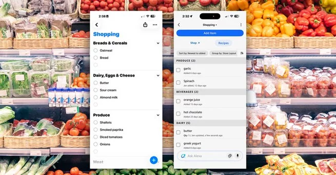
The Alexa app shopping list didn’t break overnight. Small interface changes gradually added friction, but the latest redesign accelerated the problem. The shopping list is no longer front and center, requiring extra taps to find and edit. Visual clutter competes for attention, turning a basic checklist into something that feels more like a storefront.
Instead of opening to a clean list, users are met with prompts, suggestions, and features they didn’t ask for. Adding an item manually takes longer, and reviewing the list while shopping feels unnecessarily complicated. For a task meant to save time, the new design does the opposite.
When AI Takes the Spotlight, Basics Suffer
The Alexa app now places its AI assistant experience at the center of the interface. While advanced features sound appealing on paper, they come at a cost. Everyday tools like shopping lists feel buried beneath conversational prompts and recommendations.
This shift suggests the app is trying to do too much at once. Users who simply want to manage groceries don’t need constant nudges or upsells. The result is frustration, especially for people who relied on Alexa for quick, repeatable routines.
Why Some Users Are Switching to Simpler List Apps
As the Alexa app grows more complex, simpler alternatives feel refreshing. Other list tools focus on clarity, speed, and minimalism. Open the app, see the list, add or check off items, and move on. There’s no guessing where things are or why the interface changed.
Voice assistants may still have quirks, but their companion apps often stay out of the way. That contrast makes Alexa’s redesign feel heavy-handed. Users aren’t rejecting smart assistants entirely; they’re rejecting unnecessary complexity.
Cluttered Design Undermines Trust and Habit
Habits are fragile. Once a daily tool stops working smoothly, people quickly lose confidence in it. The Alexa app shopping list was part of many household routines, from meal planning to weekly grocery runs. Breaking that flow breaks trust.
When users can’t rely on an app to behave consistently, they stop building habits around it. Over time, that erosion matters more than flashy new features. A smart assistant earns loyalty by being dependable, not distracting.
What This Means for the Future of the Alexa App
The backlash against the Alexa app redesign offers a clear lesson. AI-powered experiences should enhance core features, not overshadow them. Users expect innovation, but not at the expense of simplicity.
If Amazon wants to win back trust, it may need to rethink how much complexity it introduces into everyday tools. A clean, optional shopping list mode could go a long way. Listening to real-world usage patterns matters more than pushing the latest technology trend.
A Reminder That Simple Often Wins
The Alexa app situation shows how easily good products can lose their edge. Convenience, not capability, is what made voice assistants popular in the first place. When an app forgets that, users quietly move on.
Smart home technology works best when it fades into the background. Shopping lists shouldn’t feel like a negotiation with software. Until the Alexa app returns to that philosophy, more users are likely to choose tools that respect their time and attention.


Contact Information


Suggested Writers
-

2.5K articles
-

1.3K articles
-

34 articles
-

28 articles

Comment