Microsoft’s Windows 11 Start Menu Redesign: What Could Have Been?
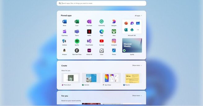
Microsoft’s Windows 11 Start menu is getting a fresh redesign, offering users more customization options and a larger layout. One of the most exciting changes is the ability to remove the “recommended feed” of apps and files. However, the design process involved much more than just these tweaks. Microsoft has unveiled several rejected concepts for the Start menu, showcasing unique and ambitious ideas that could have radically changed the user experience.
When it comes to redesigning iconic software features like the Start menu, companies like Microsoft often explore a variety of design concepts before finalizing their decisions. These prototypes include everything from widget-like features to vertical layouts that take up the entire screen. Although many of these concepts were ultimately not chosen, they provide valuable insight into Microsoft's creative process and their commitment to delivering an optimized and user-friendly interface.
Exploring Microsoft’s Rejected Start Menu Concepts
In a recent blog post, Microsoft shared several conceptual designs that were tested for the new Start menu in Windows 11. One of these designs featured a more rounded menu with widget-like functionality, allowing users to quickly access Teams meetings, YouTube videos, and recently used files from a dedicated "For You" section. Another concept divided the Start menu into distinct sections, focusing on app categories, with a separate area for personal recommendations.
One particularly bold idea involved using a full-screen landing page for the Start menu. This layout included shortcuts, apps, files, and dedicated sections for personalized features such as access to Android phones, app lists, and creative tools. The design even incorporated vertical scrolling, taking advantage of the entire vertical space on users’ screens. While some of these ideas may have been too radical for Microsoft to adopt, they show just how far the company was willing to go to innovate.
User Testing and Feedback: Shaping the Final Design
Microsoft didn’t just rely on internal feedback when shaping the new Start menu design. The company conducted extensive testing with more than 300 Windows 11 fans, using heat maps, scroll wheel tracking, and even user reactions to gauge the effectiveness of each concept. This process helped the design team fine-tune the interface to ensure it met user needs without deviating too far from the familiar layout many Windows users are accustomed to.
Ultimately, the focus of the new Start menu is on offering greater customizability, speed, and usability. By maintaining key elements of the traditional Start menu and giving users more control over their interface, Microsoft hopes to deliver a seamless experience that feels both fresh and familiar.
Looking Ahead: What’s Next for Windows 11 Users?
As Microsoft continues to refine the Start menu, Windows Insiders will begin testing the new design later this month. Once the feedback is collected and any necessary adjustments are made, the redesigned Start menu will roll out to all Windows 11 users in the coming months. With these changes, Microsoft is aiming to provide a more streamlined and personalized user experience, balancing innovation with familiarity.
A Sneak Peek into Microsoft’s Design Future
While the rejected Start menu concepts may never make it to the final product, they provide a fascinating glimpse into Microsoft’s design process. Whether it’s an expanded layout, a full-screen interface, or more widget-based interactions, Microsoft is clearly committed to pushing the boundaries of user experience. As the redesigned Start menu becomes available to all Windows 11 users, it will be interesting to see how these innovative ideas influence the evolution of Windows.


Comment