
-
3 minutes, 32 seconds
Apple’s macOS Tahoe 26 Liquid Glass design leaves Mac users unimpressed
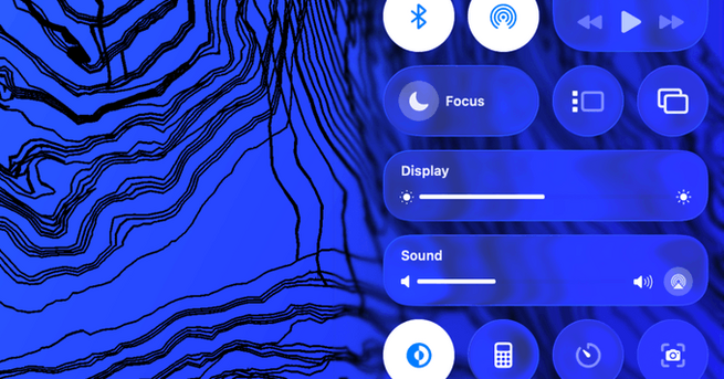
Apple’s latest software update, macOS Tahoe 26, introduces the much-hyped Liquid Glass design to Mac computers, aligning with the new look already seen on iOS and iPadOS. For those wondering whether this aesthetic overhaul transforms the Mac experience—it doesn’t. While Apple describes the new design as sleek and fluid, early testers using the public beta on machines like the M4 MacBook Air report that the change feels more cosmetic than functional. If you were hoping this would breathe new life into your Mac interface, you may find the redesign underwhelming.
What is macOS Tahoe 26 Liquid Glass design?
The Liquid Glass design aims to give macOS a more modern and dynamic look with frosted translucency and softer gradients. It was previewed at WWDC 2025 and promised a visually cohesive Apple ecosystem across devices. However, instead of bringing energy to the Mac interface, it seems to replicate a vague Windows Vista vibe—something longtime Mac users aren’t exactly praising. While there have been subtle tweaks between the developer and public betas, they haven’t done much to shift perceptions. Many now view it as an unnecessary polish rather than a productivity-enhancing change.
Mac users react to Liquid Glass: ‘It’s just there’
Early adopters have described the macOS Tahoe 26 Liquid Glass design as “fine” or “meh,” with some saying they hardly notice it anymore. The aesthetic is no longer as jarring as it was in the first developer beta, but it still doesn’t offer the clarity or sharpness found in the previous macOS Sequoia interface. Though Apple continues refining elements like translucency levels and color saturation, the improvements feel minimal at best. Instead of boosting morale or user engagement, the update has left many questioning whether it was needed at all.
Design without purpose: Has Apple missed the mark?
What’s clear from early testing is that macOS Tahoe 26’s Liquid Glass design doesn’t bring significant functional upgrades. Unlike past macOS updates that introduced new tools or productivity features, this one leans heavily into visual flair. On a large Mac display, the design changes fade into the background and fail to offer meaningful interaction improvements. With growing expectations for Apple to innovate, users are calling for updates that prioritize substance over style. Unless Apple introduces more practical refinements before the final release, Tahoe 26 might go down as one of the more forgettable macOS updates.

2.5K articles

1.3K articles

34 articles

28 articles


Comment