
Google’s New Logo Update: What You Need to Know About the 2025 Change
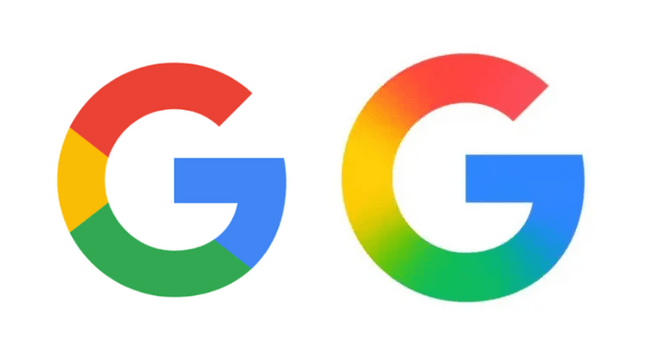
Google has just refreshed its iconic "G" logo for the first time in nearly a decade. If you’ve noticed a subtle change while using the Google app on iOS, you’re not alone. The latest update blends the classic red, yellow, green, and blue colors of the Google logo into a smooth gradient, creating a more modern and cohesive look. But what does this logo update really mean for Google’s branding? Let’s take a closer look at the changes and their implications for the tech giant in 2025.
For nearly ten years, Google’s logo remained unchanged. The last major update came in September 2015 when the company switched to a more contemporary sans-serif font, along with a redesigned "G" logo. This 2025 update isn’t as dramatic but carries a new touch: the individual color blocks of the "G" now flow together seamlessly in a gradient. This shift aligns the logo with the gradient design seen in Google’s Gemini branding, further enhancing the visual harmony of its apps and products.
Currently, the updated logo appears only on the iOS version of the Google app. If you’re using Android or accessing Google on the web, the "G" remains in its traditional form with distinct color borders. This minor yet important tweak reflects Google’s ongoing efforts to modernize its visual identity across platforms.
While the change is relatively subtle, it’s a strategic move to maintain consistency across Google's brand ecosystem. With the growing prominence of products like Google Gemini, this logo update could be a part of a larger push to unify their design language and user experience. As we enter 2025, it’s clear that Google is focusing on a sleek, gradient-driven aesthetic, signaling its intention to stay relevant and innovative in a fast-evolving tech world.
Google’s decision not to immediately respond to inquiries about the update might suggest they are taking a more measured approach to this transition. Despite the quiet rollout, this new logo is bound to catch the eyes of users and brand enthusiasts alike. The change might be small, but it’s a significant step in refining Google’s image and bringing it in line with the company’s long-term design strategy.
By updating its logo in this subtle yet effective way, Google has once again demonstrated its ability to evolve while maintaining the brand recognition that has made it one of the most valuable companies in the world. Keep an eye out for more changes as Google continues to enhance its app experience and branding in 2025.


Comment