


Apple’s Liquid Glass Design: First Impressions from Public Beta
-
3 minutes, 43 seconds
Diving into Apple’s Liquid Glass: What You Need to Know
Apple’s new Liquid Glass design language is finally available for public testing in iOS 26, iPadOS 26, and macOS. If you’ve been wondering how the redesign actually feels in day-to-day use, you're not alone. After a couple of months of refinement, Apple has toned the design down, addressed key concerns like Control Center clutter, and amplified its signature visual flair in others. So, is Liquid Glass a revolution or just aesthetic noise? Early impressions suggest it’s a bit of both — a design that impresses at first glance but may not always enhance usability.
First Reactions to Apple’s Liquid Glass from iOS 26 Beta Users
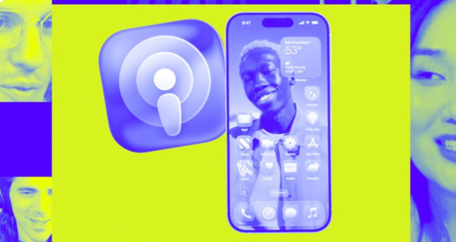
The public beta has triggered a wide range of responses. Some users are calling Liquid Glass “sleek and futuristic,” while others argue it’s more style than substance. Victoria Song from The Vergecast highlights AI-powered features on the Apple Watch, like the Workout Buddy and gesture controls, which mesh well with the new visuals. Antonio G. Di Benedetto dives into the Mac’s revamped Spotlight and new Phone app — both of which feel more responsive but not necessarily because of Liquid Glass. The new design language is clearly optimized for fluid transitions and ambient feedback, but not everyone is convinced that form outweighs function.
How Liquid Glass Fits into Apple’s Larger Software Vision
Apple’s move toward a more visually immersive experience follows trends set by rivals like Samsung and Google. However, it’s doing so in classic Apple fashion: with a heavy focus on refinement. The Control Center got a much-needed facelift after early complaints, but critics still point to usability issues, especially on Macs. The subtlety of Liquid Glass in watchOS 26 reflects Apple’s attempt to balance aesthetics with function, making sure visuals never overwhelm the user experience. It’s clear this design isn’t a one-size-fits-all success — its impact varies across devices and use cases.
Is Apple’s Liquid Glass Here to Stay?
Liquid Glass feels like a bold experiment rather than a fully polished product. It may evolve over future updates, especially as feedback rolls in from developers and public beta users alike. Apple has shown a willingness to fine-tune aggressively based on user feedback, and this design shift is no exception. Whether it becomes a lasting part of the Apple ecosystem or a transitional style remains to be seen. For now, it signals Apple’s intent to make software feel more alive, reactive, and visually unified — even if that means occasional missteps.


Contact Information


Suggested Writers
-

2.5K articles
-

1.3K articles
-

34 articles
-

28 articles

Comment